TextNow App Design Analysis — UI Screenshots & Interface Patterns
Explore TextNow's app interface design. Screenshots, UI patterns, and UX analysis of the free calling and texting app used by millions.


// Generated by scripts/generate-blog-content.mjs. Do not edit.
TextNow App Design Analysis
TextNow provides free phone service — calling, texting, and a real phone number — supported by ads. With millions of users, its interface must balance monetization (ads) with usability (core communication features). Here's how they do it.
Browse all TextNow screenshots →
The Design Challenge
TextNow faces a unique tension: it needs to show ads to generate revenue, but ads in a communication app risk making conversations feel cheap or unreliable. The design must:
- Keep messaging feel fast and native despite being VoIP-based
- Integrate ads without disrupting conversation flow
- Compete visually with iMessage and WhatsApp
- Communicate "free" without feeling "cheap"
Messaging Interface
TextNow's chat UI follows established messaging conventions with some smart additions:
- Native-feeling bubbles with read receipts and typing indicators
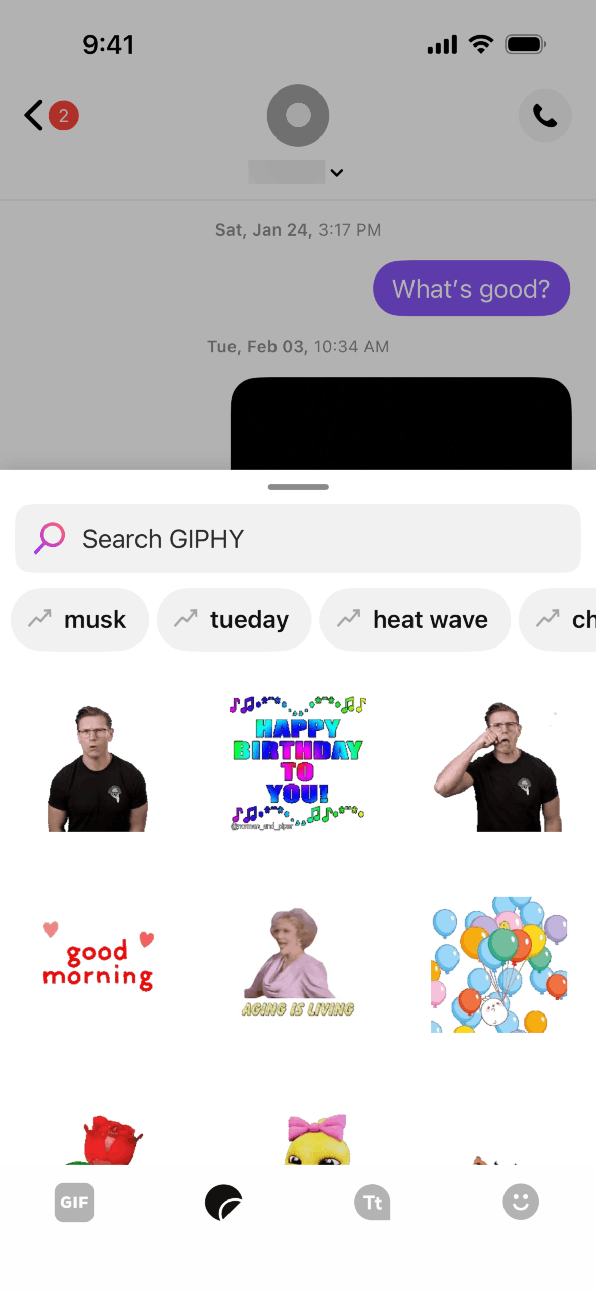
- Media sharing (photos, GIFs) with preview thumbnails
- Ad placement between conversations in the inbox, not within individual chats
- Group messaging with participant avatars
Key insight: Ads appear in the conversation list (like a "sponsored" contact), never inside an active conversation. This preserves the intimacy of 1-on-1 messaging.
Phone & Calling
The dialer and call interface is clean and functional:
- Standard T9 dialer with contact search
- Call screen with large, accessible buttons
- Voicemail with visual voicemail transcription
- Call history with contact grouping
Settings & Account
TextNow's settings reveal the business model complexity — free users see upgrade prompts, while the settings themselves are straightforward:
- Account management with phone number display
- Notification preferences
- Ad preferences and premium upgrade CTAs
- Privacy and blocking controls
What Other Apps Can Learn
- Monetize around, not within — Placing ads in list views rather than content views preserves the core experience quality.
- Match platform conventions — TextNow's iOS app looks like iOS Messages. Users don't need to learn a new interface.
- Upgrade paths, not walls — Free features work fully. Premium removes ads and adds features. The free product is genuinely useful.
Browse TextNow's full interface — See all TextNow app screenshots →
Related:
Founder of Gummble. I build and maintain the Gummble catalog — UI screenshots and UX flows from 1,500+ real iOS, Android, and web apps — and write about the design patterns I see across them.
See these patterns in action
Browse 1,500+ apps across shipped iOS, Android, and web products.
Browse the Library →